Patterns of Disguise
Dissimulating Harmlessness
Disguises
Dark patterns in this category use the visual properties of objects, such as size, shape, color, and depth to make a malicious object appear to be another, more benign object instead. In this archetypal example, the designer has Photoshopped two small specks onto the ad banner, making it seems as if a bit of dirt or food has become stuck to the devices screen. Like the fake hair in Figure 1, this illusion succeeds because of the naturalistic treatment.

Again, we have a high-contrast, low-shadow situation that enhances the interpretation that the specks are on the surface of the screen. Furthermore, there are actually multiple specks of various sizes and shapes. This irregularity lends credibility to the illusion.
Finally, the specks are placed almost randomly on the banner: with plenty of surrounding whitespace to draw attention but enough asymmetry to make it seem accidental. This example relies on the gestalt principle of common region which states that when two objects occupy the same area, one is perceived as laying atop the other.
Something Else
As the author of this tweet wrote in response to the image below: "Come on @strikingly, if I'm on a website and I click that little down arrow at the bottom, I obviously want to hide the panel, not be taken to your website! #darkpattern alert" (Fréour, 2018).

This example uses a modified technique. Instead of disguising itself as a natural object, the malicious link masquerades as another interface element entirely: a collapse icon. On mobile screens, when drawers or panels "slide" into view atop the main interface, typically there is by convention a way to slide it back: often an arrow of some sort pointing in the direction the user wants to send the panel. When the panel is on the bottom of the screen, as in this example, it points downward, to hide the panel in that direction.
In this example, the downward pointing arrow does not collapse the panel but instead takes users to the sponsor's website. This illusion succeeds not by mimicking the natural world like the fake hair or the speck of dirt, but instead by mimicking a user inferface element. Since the designer is mimicking an artificial object, the job is much easier and the risk of detection is much lower.
Unless the user has encountered this particular disguise before, there is no way to know what will happen when clicking the downward caret.
Are You (Not) Sure?
The kind of mêtis involved here is more radical, involving as it does the meaning of basic words, colors, and interface concepts. It's seeking to reverse the user's intent to unsubscribe, and it does so, as before, by presenting an array of options. Rather than simple checkboxes, however, these options are configured by a kind of toggle, whose function is encoded with the words.
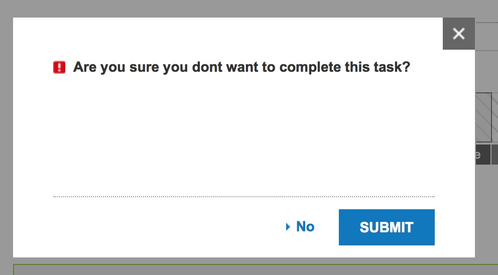
Rather than discussing one thing as another, or hiding something in plain sight, this kind of mêtis has transformed the very nature of what yes and no means, what red and green means, what selected and unselected means. Many users could easily misinterpret these form elements and unintentionally enable the whole suite of marketing spam targeted at whatever poor inbox the user owns.
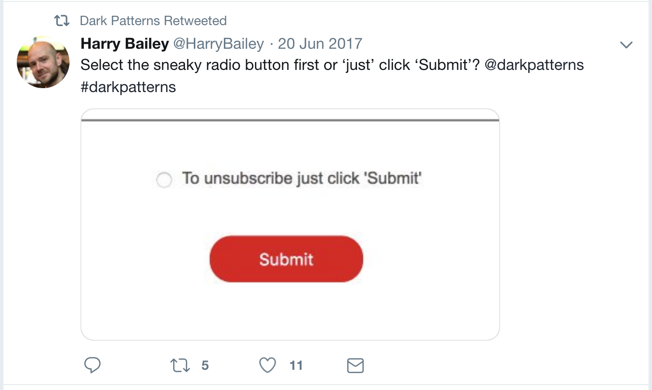
Sneaky Submit Button
Aside from these semiotic confusions, the disguise also works by exploiting what's known as Jakob's Law of User Experience, after user experience pioneer Jakob Nielsen, which states: "Users spend most of their time on other sites. This means that users prefer your site to work the same way as all the other sites they already know" (Yablonski, 2019b).
As Marcel Detienne and Jean-Pierre Vernant (1978/1991) wrote, "Being on the watch for anything that might happen is a way of being able to forestall the cunning tricks of an enemy and to devise, in advance, ways of trapping him in his own net" (p. 311). When the sophist, endowed with mêtis, practices this art, he becomes a "living trap" (p. 40) or "living bond" (p. 41) who ensnares his listeners in "the glittering web of his words" (p. 22).