
Three Cartoon Voices (The Integration of Cartoon and Comic)
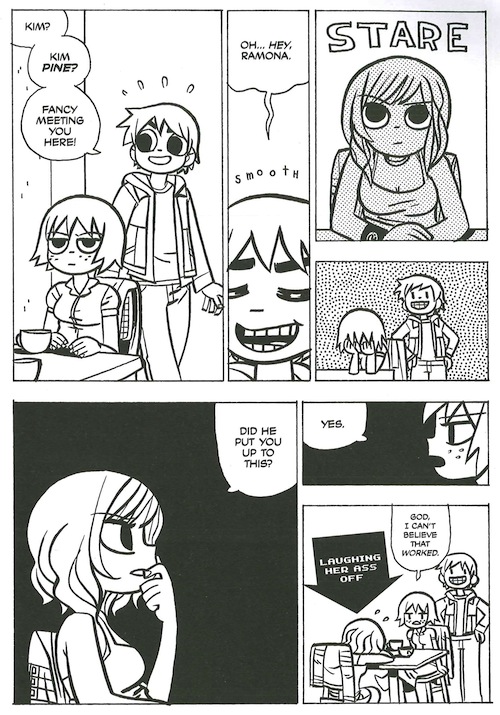
Best American Comics 2010, edited by Neil Gaiman (2010), is a useful tour through a variety of cartoon-driven storytelling styles.[1] Among many fine choices, Gaiman (2010) included an excerpt from Bryan Lee O’Malley’s (2009/2010) popular comic Scott Pilgrim Versus The Universe, populated with big-eyed, shaggy-haired kids, drawn clearly and appealingly in thick black lines. These cartoons lack the slick conformity of mainstream hero comics, but average readers are nevertheless likely to find them visually welcoming. Jason Heller (2007), introducing an Onion A.V. Club interview of O’Malley, noted that O’Malley’s Scott Pilgrim comics “[dovetail] romance, comedy, martial arts, and science fiction with a cartoony style that draws from manga and video games”; they are built around Scott Pilgrim, “a hapless twentysomething who must battle his girlfriend's evil ex-boyfriends while learning to cope with a gay roommate, a struggling band, and the looming responsibilities of adulthood.” The comic is fittingly set in diners and living rooms and other crucibles for the romantic confusion of twenty-somethings in rock bands. This is a comic that exists toward the right-hand, iconic, swift-reading side of Scott McCloud’s (1993/1994) stylistic pyramid (discussed in the "Cartoons as Perspicuous Objects" section). The cartoons (see below) are uniform and clear but also unfussy and loose; the aesthetic of Scott Pilgrim is one of affected and effective casualness, a comics equivalent to Scott Pilgrim’s own self-consciously messy (but not too messy) hair. The panels are uncrowded, and special effects in the panels—abstract dots and lines and grey-outs and so on—tend to signpost the emotional states of the characters. It looks like the comic is going to be lighthearted and energetic, maybe the comics equivalent of a smart summertime comedy on film, and that is what it is. The drawings and the story are artfully blended.
from Scott Pilgrim vs. The Universe
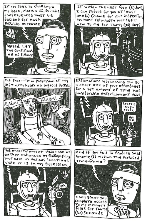
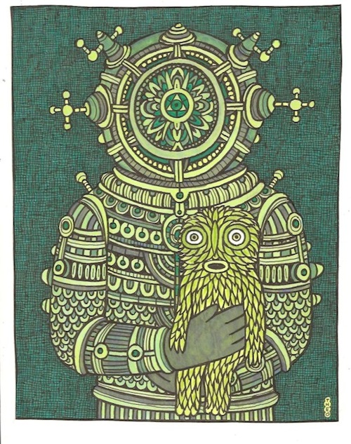
Also in Best American Comics 2010 (BAC10), Theo Ellsworth’s (2009/2010) strange, clever story, “Norman Eight’s Left Arm,” features robots (pictured in the header above, and below at right, in a scrollable box) that look as if they were kludged together from leftover bric-a-brac in a madman’s workshop. They sit across from one another at a formal dinner table in the middle of a woods; they make a wager that involves (no surprise) Norman Eight’s detachable left arm. Woodland critters peek out of the underbrush. Compared to O’Malley’s (2009/2010) drawings for Scott Pilgrim, Ellsworth’s (2009/2010) playful drawings for “Norman Eight” are less inviting and familiar-feeling, more intricate but also less careful, controlled, and refined. The backgrounds are both more full and more full of things that do not immediately make sense, iconic or not. Before the robots speak, their stilted robot speech is foreshadowed not only by their posture but also by the linework from which they are formed and by the ways their setting surrounds them. The comic, like Scott Pilgrim, features mostly big panels, and the panels in this case are fairly uniform, often six-to-a-page in a grid, suggesting (accurately) that the story will be evenly paced and easy to follow. As with Scott Pilgrim, the drawing here fits on the right-hand side of McCloud’s (1993/1994) stylistic pyramid. However, it inhabits a space further left (and further up) in the pyramid, and, as McCloud’s (1993/1994) pyramid suggests is likely, the drawing style itself is less immediately accessible than O'Malley's (2009/2010) Scott Pilgrim drawing. Still, “Norman Eight” looks quirky and funny and not prohibitively difficult to read, and it is quirky and funny and readable. Like Scott Pilgrim, “Norman Eight” is drawn in a style that is nicely fitted to its humor and perspective. More than that: Scott and “Norman” are drawn in styles that are integral to their content. Cartooning style, for these comics, does not just fit or amplify the stories. For comics like these, narrative voice is inseparable from visual style.
from "Norman Eight"
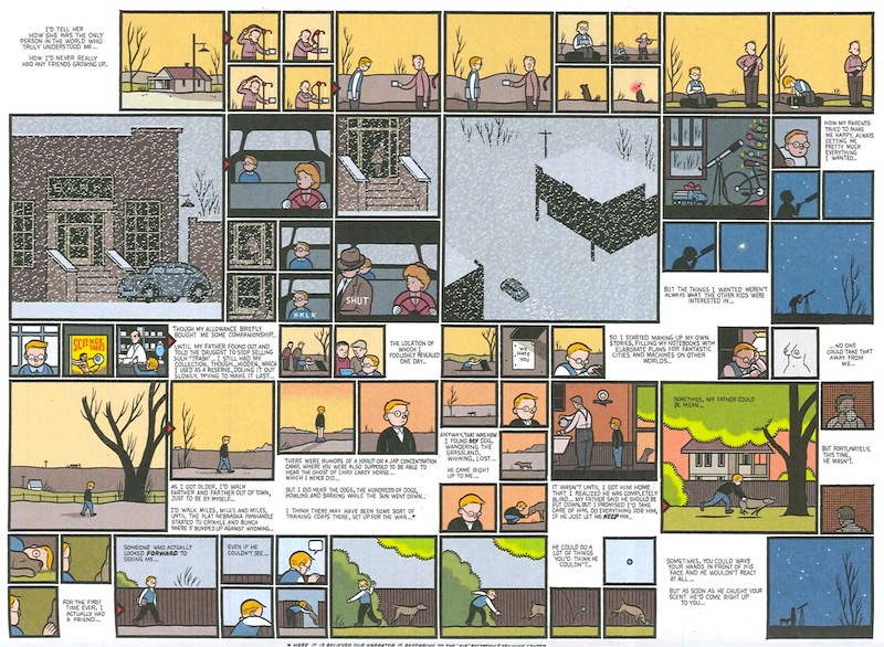
To be clear, swiftly read, iconic cartooning does not guarantee an easily accessible, straightforward comic. BAC10 also includes an excerpt from Chris Ware’s (2008/2010) developing Rusty Brown comic (originally published in Ware’s Acme Novelty Library #19). Art Spiegelman has said that Ware’s much-praised Jimmy Corrigan—The Smartest Kid on Earth “seems to . . . have a kind of formal, Joycean complexity that shows what a really visually literate comic can be. And what’s more amazing is that it actually does have an emotional strength, that it’s not just some kind of formal experiment. It’s a rather moving literary work” (Peeters, 2004). The Rusty Brown excerpt in BAC10 is similar in form, style, and complexity to Jimmy Corrigan. It contains many panels, often quite small, carefully designed into each page. Ware’s drawing is economical and clear, almost architectural (as critics commonly point out), suggesting no wasted or meaningless mark. His concerned-looking cartoon figures are frequently overwhelmed physically, not only by their environments but also by the ways the page itself closes in on them. Together, the style of Ware’s pages and the look of his cartoons suggest that this will be a story about Rusty Brown’s unhappiness, and so it is. The drawing style is more iconic than “Norman Eight” or (arguably) Scott Pilgrim, yet Ware’s visual text is much more dense, his meaning less accessible. There are more objects on the page. Their relationships to one another are sometimes obscure. Even the design of these pages announces the story’s relative complexity. At times, the panels seem to demand simultaneous or recursive reading, rather than unidirectional sequential reading. A look at a Chris Ware page suggests that sometimes the iconic, readily interpretable images on the right-hand side of McCloud’s (1993/1994) pyramid can be deployed in dazzlingly complex ways.
from Acme Novelty Library #19
Those who have seen work by O’Malley, Ellsworth, or Ware will know that my textual descriptions barely begin to describe their artwork. In a well-made comic, the drawing style announces something significant about the comic’s content, even before anyone reads a word, and the drawing itself—from the cartoons down to the lines that comprise them—is always a significant part of the content and voice of a comic.[2] These perspicuous cartoon objects may be produced instinctively by talented comics artists, but they are nevertheless analytical images, abstracted from the real in ways that draw readers' attention to relevant possessive attributes of the things they depict. For comics, effective cartoons are significance-laden signs. They are gathered and sequenced on the page for their intended audiences. They draw on semiotic resources likely to speak to those audiences. As others have said, cartoons in comics are not simply illustrations of the words in the speech bubbles. Just as in Ware’s (2004b) drowning man example, attentive reading of a cartoon image does not necessarily result in (or need to result in) a translation of the image into words, and no such translation is required either to establish or to convey the cartoon’s significance. Sometimes no such translation is possible. To read the words in a comic without also attending to the images is to fail to read the comic—is to fail to pay attention to all that the comic is communicating. It is at best a kind of weak skim reading that ignores the commentary and analysis embedded in the cartooning. Every object on the page contributes to the voice of the comic and is part of the comic’s content; everything on the page speaks.
[1] Since 2006, the Best American series has been releasing annual comics anthologies, curated by interesting practitioner–editors (in order, 2006–2013: Harvey Pekar, Chris Ware, Lynda Barry, Charles Burns, Neil Gaiman, Alison Bechdel, Françoise Mouly, Jeff Smith). Offerings in the series can be useful as affordable introductions to several different comics artists and their styles.
[2] This point about comics page style has an imperfect parallel in paragraphing style. An academic article simply looks, at first glance, different than a textbook page or a newspaper. The page signals something about its content before the reader begins to decode the words on the page, and that initial visual signaling is, in fact, one piece of the document’s content, significance, and rhetorical effort. This is not to say that first impressions—of paragraphing or cartooning—cannot be dead wrong; but first impressions are always part of the meaning-making effort.

