Conclusions
As a webtext, Viz is constantly changing. I reviewed this site between March 20 and March 30 and then again between May 2 and May 4, 2008. It could be that I happened to review Viz at a slower period when only a few assignments asking for visual rhetoric production were present. As with all dynamic webtexts, this could definitely change in the near future—and I hope it does. And, indeed, there seemed to be an increasing number of assignments asking for visual design the longer I reviewed the site. Ideally, it would be wonderful to see assignments that called for both complex visual design and analysis—students could analyze visual artifacts even while they were enacting these same principles within their own design of the analysis project. In this way, analysis could become part of the design and design could inform the analysis.
Fortunately, by the time I ended my review of Viz, there were at least
four assignments that asked students
to construct some type of visual rhetoric for an audience other than the
instructor. The first assignment asked students to construct a proposal
argument solving some problem and then, from this proposal argument, to design
a website that in some way encourages the audience to take action to solve
the problem. The assignment encouraged students to pick an audience that
could best implement the solution or bring about change. The
second
assignment also asked students to create a proposal, but this time they
could do this by creating a website, PowerPoint, or movie. Sadly, neither assignment
has the depth of detail in discussing how to teach
rhetorically effective design that the other assignments do in
analyzing visual artifacts.
The third assignment asked students to design a PowerPoint presentation. The
presentation had to incorporate visual elements,
include 10 slides, be done collaboratively, and last 10 minutes. Other than
that, the assignment seemed rather vague on what the presentations would
actually be about. Also, the objectives of the assignment seemed more
focused on teaching students the mechanics of PowerPoint software than on
teaching them how to use visuals in rhetorically effective ways or on helping
them become more rhetorically savvy in their delivery. Again, this seems
like a missed pedagogical opportunity. Why couldn't the assignment achieve all three
goals simultaneously (as well as teaching students how to construct
arguments in multiple ways)?

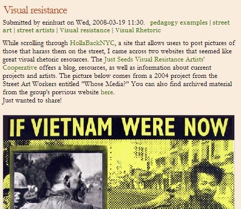
Visual Resistance Blog Entry on Viz
The fourth assignment was the most creative and demanding in terms of the students' production of visual rhetoric. It asked students to develop a storyboard for a film. Students were first required to write a story statement. Then students were asked to compose a brief statement of what their film is about, a story outline, a treatment, a script, and a manifesto in which they articulate and then defend the creative and rhetorical choices they have made in their film. While the assignment did not ask students to actually shoot a film, this is understandable given the technological sophistication and time requirements needed to properly shoot and edit a film—especially in a first-year writing course where rhetorical choices need to be emphasized over technological skills. But even without shooting a film, students still needed to negotiate the creative and rhetorical choices required in order to make the film, giving students valuable rhetorical experience within the film medium. Also, this assignment was structured enough that if teachers have access to filming and editing technology that is fairly easy for students to learn, teachers could easily adapt this assignment so that students could actually shoot a short film.
Overall, including these four assignments, Viz has incredible depth in the way that it discusses and analyzes the visual. The site would be even richer if it included that visual rhetorical depth in more assignments that invited students to actively engage in creating their own visual rhetoric.