Introduction
to the Special Issue:
Data Visualization in Composition Studies
John R. Gallagher and Dànielle Nicole DeVoss
Why Data Visualization? Why Now?
The initial two decades of the twenty-first century have seen an explosion of data. The rise of social media, the internet of things (IoT), and our seemingly constant activities with/in/across networked technologies (Boyle et al., 2018) have led to this explosion of data. Aaron Beveridge (2017) has even argued, within the context of writing pedagogy in an era of big data, that “data-driven arguments and their accompanying visualizations are now a prevalent form of multimodal writing” (par. 1). Coupled with dramatic developments in speeds and computational power, data visualizations, as a concept and tool, have come to dominate our social imaginaries and public discussions. As the century now enters its third decade, we believe the time is right for developing more explicit connections between writing studies scholarship and data visualization. We anticipate that you might, as a writing studies scholar, be thinking: Isn’t data visualization just visual rhetoric or multimodality in a new package?
We too wrestled with this question. In our early conversations imagining and editing this special issue, we discussed the ways in which data visualization merits our scholarly attention, including the following:
- data visualization invites—and, at times, requires—us to return to our earlier conversations and analyses of visual rhetoric and multimodal composing;
- data visualization asks that we continue to reflect on what “composition” is and what it means for data to be used, constellated, choreographed, and visualized;
- data visualization invites us to draw from digital humanities and from other fields that have long relied on data visualization techniques (including more traditional approaches like charts, graphs, and diagrams); and
- data visualization merits that we shift our theoretical orientations and methodological frames so that we can better account for the various means through which we tell stories and share data.
Thus, one of the key moves made by authors in this special issue is to interrogate and complicate definitions and descriptions of data visualization to represent the complexity of data visualization storytelling. The work in this collection provides rich, engaging, and provocative lines of scholarship to surface resonances between visual rhetoric, multimodal composing, and data visualization.
To be certain, though, we are not the first writing studies scholars to interrogate the concept of data or even data visualization. Recent work in technical communication (TC) has examined data visualization (for excellent overviews, see Lisa Melonçon and Emily Warner, 2017, as well as Charles Kostelnick’s 2015 special issue in the Journal of Business and Technical Communication). Alongside this TC work, composition scholars have examined intersections of memory and visualizations in a digital age (Long, 2016) as well as constructed the writing genealogy project (Miller et al., 2016). The Writing Studies Tree (https://www.writingstudiestree.org/) is “an online, crowdsourced database of academic genealogies within writing studies; in other words, it is an interactive archive for recording and mapping scholarly relationships in Composition and Rhetoric and adjacent disciplines.” The idea of the Tree emerged in a grad seminar taught by Sondra Perl in 2011. A significant number of scholars, coders, designers, and two grants contributed to building the Tree, which launched live at the Conference on College Composition and Communication in 2012. Other directly pedagogical projects related to data visualization include Rachel Rayl’s (2015) work with learning how STEM students might learn to visualize data more effectively and Madeline Sorapure’s (2010) approach to information literacy.
Our goal in this introduction is to discuss data visualization and its relationship to more familiar (and accepted) terms in writing studies, including visual rhetoric and multimodality.
From Visual Rhetoric to Multimodality to Data Visualization
Writing studies has long sought to develop robust relationships between verbal and visual texts, between the alphabetic and the pictorial. From petroglyphs to illuminated manuscripts to early text-only computer spaces to emergent visual-digital interfaces, we’ve paid attention (to varying degrees) to the ways in which information is shaped for us, by us, and around us. In reviewing literature related to visual rhetoric specifically from the early to mid-2000s, for instance, the field expanded its discussions from visual rhetoric strictly to discussions of multimodal work more broadly. As this expansion occurred, we would suggest that eight themes emerged:
- Arguments related to the dominance of the textual (presented most compellingly perhaps by Cynthia Selfe across her work [2004, 2007, 2009], but especially in “Toward New Media Texts: Taking Up the Challenges of Visual Literacy” in Wysocki et al., 2004).
- Analysis of the downplay of nontextual modes (addressed across Anne Frances Wysocki’s body of scholarship; 2003, 2005; Wysocki & Jasken, 2004).
- Discussions of the interplay of the verbal and the visual (e.g., W. J. T. Mitchell’s work has been brought fruitfully to bear in rhetoric and writing studies conversations, especially his 1994 Picture Theory).
- Scholarship focused on the role of new technologies to writing (e.g., Hocks & Kendrick, 2003; Wysocki et al., 2004).
- Explorations across the consumption and production of texts (e.g., the National Council of Teachers of English 1996 statement “On Viewing and Visually Representing as Forms of Literacy”; Diana George’s 2002 “From Analysis to Design”; Lynch & Wysocki, 2003).
- Discussions of evaluation and assessment of visual and multimodal work, including the work of students and the work of colleagues (e.g., Ball, 2006; McKee & DeVoss, 2013).
- Issues of intellectual property where multimodal texts are concerned, including visual elements (e.g., Steve Westbrook’s 2006 “Visual Rhetoric in a Culture of Fear”).
- Complexities related to doing visual rhetorical research (e.g., Heidi McKee’s 2008 “Ethical and Legal Issues for Writing Researchers in an Age of Media Convergence”).
More recently, our visual rhetoric and multimodal interests have begun to turn toward data visualization, likely due to three reasons. First, visual rhetoric, as an area of study, draws inherently on the rhetorical tradition, including the somewhat limited and static ancient and Eurocentric view of persuasion and its accompanying five canons (invention, style, arrangement, memory, and delivery). Data visualization, as term and as practice, reaches out to other traditions, disciplines, and communities that do not necessarily explicitly connect to the rhetorical tradition. Second and relatedly, data visualization helps to create opportunities for bringing rhetorical concepts (if no longer in name) to other domains, thereby creating epistemological, institutional, and political opportunities. These domains can include music (see Lauren and Hart-Davidson in this issue), computer sciences, mathematics, and engineering(s). Third, data visualization is most often created and shared in the context of networked technologies and social media. Whereas the visualizations of the past were often static and fixed (e.g., a traditional painting hanging on the wall of a museum, a bar chart presented in the context of a report), data visualizations are often dynamic, interactive, and responsive.
Two recent data visualization projects in writing studies have primed the field(s) for innovative work. First, Derek Mueller (2012, 2017) provided a theoretical and methodological approach to better understand disciplinarity via tag clouds, endnotes, works cited, tabular bubble charts, animated indices, radial models, sparkline graphs, semantic worknets, plot graphs, tables, bar charts, line graphs, metaphorical maps, actual maps, cartographic projections, and starbursts. His Network Sense (2017) also included iconographic organizers as techniques for guiding readers. Second, Jim Ridolfo’s RhetMap project (http://rhetmap.org/) leverages data visualizations to assist with job market preparation and awareness. In 2012, Ridolfo started mapping doctoral programs in rhetoric and composition studies. He did so in direct response to a post by Collin Gifford Brooke (2012) about the future of the MLA Job Information List. Brooke wrote:
I wanted to second your comments about opening up the job list database, which for all intents & purposes is the same (inc. the crappy interface) that they used in the mid-90s. A much richer set of metadata about the jobs could be gathered by MLA (and made available to searchers) if the arbitrary scarcity of the print list is set aside and MLA were to take their curative obligation seriously.
RhetMap creates regularly updated maps of job postings in rhet/comp, providing an important resource for job-seekers and for others interested in snapshots of market trends in the field. If Mueller’s work provides us with methods and methodologies for understanding the development from multimodality to data visualization, then Ridolfo’s work demonstrates the practical (and helpful) ways that data visualization can provide for our scholarly communities.

As we see it, then, data visualization is less a radical break from past scholarship and more a developmental step for learning to recount stories for different audiences and stakeholders. We have foregrounded these audiences in the themes that the contributors raise. For example, Desiree Dighton foregrounds feminist approaches to data visualization, whereas Ben Lauren and Bill Hart-Davidson attempt to show the relationship between music and data visualization. Moreover, we have also attempted to show the diversity of meanings within the concept of data visualization, from Heather Noel Turner and Laura Gonzales’s translation project to Krystin Gollihue and Mai Nou Xiong-Gum’s dataweaving project, both of which foreground the embodied nature of data visualization that can often be lost in a screen-oriented world. We now turn to describe these projects, and the others included in this special issue, in more detail.
Overview of Special Issue Contents
There are three webtexts in the Topoi section of this special issue. In “Arranging a Rhetorical Feminist Methodology: The Visualization of Anti-Gentrification Rhetoric on Twitter,” Desiree Dighton shares the methodological and visualization processes, practices, and products crafted while working with more than 2 years’ worth of tweets related to gentrification. Her project focuses on “how writing and visual rhetoric circulate to activate publics and ignite collective actions” and specifically how that circulating visuality impacts the changing shape and sociocultural makeup of urban spaces and their communities. Dighton describes the ways in which methodological choices and visualization orientations that make room for big data and small data, large-scale analysis and situated ways of knowing, provide for analytical and critical and also generative and inventive data analysis.
Ben Lauren and Bill Hart-Davidson make theory and make music in “Sight, Sound, and Practice: An Exploration of the Ways Visualizations Can Support Learning to Compose.” The key argument they surface is that:
Visualizations of composing practice help learners, over time, to conceptualize and consolidate their command of smaller, more fundamental compositional elements, allowing them to take command of larger assemblages of these to do their composing work.
To illuminate this claim, Lauren and Hart-Davidson then perform, share, narrate, and reflect upon their process of writing and recording their original “For the 1979.” Not only do the authors offer a compelling, unique single, they also provide a deep view of their composing practices, visualized in notes, a roadmap, fingers on guitar, sticks hitting drums, crossfade actions in ProTools, and more. The webtext also offers an interactive model, inviting users/readers/listeners in to techne-practice, and conclusions that suggest ways in which we might also utilize visualization for reflective writing in other contexts, with other genres.
In “Visualizing Translation,” Heather Noel Turner and Laura Gonzales interrogate the complexity of what it means to translate—that translation carries with it grammatical, contextual, cultural, political, alphabetic, and visual considerations. They note that although research on language fluidity and diversity is extensive in rhetoric and writing studies, research on visualization in the context of translation is an understudied area. Turner and Gonzales argue, however, that “visualization… has always been embedded into translation, as translators expand beyond the constraints of alphabetic language to transform meaning for culturally and linguistically diverse audiences across contexts.” Their webtext illuminates this claim with data from their partnership and study with the Hispanic Center of Western Michigan. These illustrations anchor their claim of translation as always already visualized and anchored by visualization, and to support their recommendations that we continue to develop methodologies to explore writing and visualization.
Two webtexts make up the Praxis section: First, in “Networked (Writing) Centers: Utilizing Online Visualization Tools on Large Multi-Institutional Data Sets,” Joseph Cheatle, Genie Giaimo, Candace Hastings, and Christine Modey situate writing centers as “large data repositories” and present their cross-institutional work with a corpus of more than 2 million words and four types of data visualizations. The cirrus (word clouds), tables, collocates graphs, and word trees they produce in Voyant are anchored by the recommendations the authors have as to when, how, and to what ends each of these visualizations can be used in the context of writing center scholarship, assessment activities, and administrative work. The authors also compare all four visualizations side-by-side, calling attention to the strengths and drawbacks of each and honing in on how we can better make visible the work of our writing centers.
Madeleine Sorapure and Austin Fauni, in “Teaching Dear Data,” describe experiences adapting and applying Giorgia Lupi and Stefanie Posavec’s Dear Data project. While Lupi and Posavec exchanged postcards of visualization across a year, Sorapure’s students analyzed and visualized data about themselves in a summer 2018 multimedia writing course. The activities of the class invited students to not only be readers and interpreters of visualizations, but also producers. The webtext includes a detailed discussion and gallery of student work, including their visualizations and written and video reflections on the visualizations produced.

Tim Amidon’s “Brightness Behind the Eyes: Rendering Firefighters’ Literacies Visible” is included as an Inventio contribution, in which Amidon presents data that bring us into the field with firefighters through media clips that include kinesthetic, spatio-temporal, alpha-numeric, cognitive, tactile, and other modal attributes. Amidon also shares a set of “interactive visualizations that illuminate firefighters’ richly layered, multimodal literacy practices.” Through these visualizations—framed by rhetoric and composition studies scholarship and reports by organizations like the National Fire Protection Association—Amidon both proposes and articulates methodology around what we can learn from workplace practices that are both tacit and mundane, but also highly consequential. In doing so, Amidon makes a powerful set of claims about both data visualization and ways in which we might better understand the complex literacy practices of blue-collar work.
PraxisWiki pieces include Patrick Andrew Danner’s “Storytelling with and around Data,” in which he argues for more appropriately complexly situated approaches to data—not as raw or objective, but as persuasive, especially when it is shared through story. Shannon Fanning, in “Following the Narrative: Using Data Visualization in the Composition Classroom,” continues the exploration of data visualization, narrative, and storytelling by exploring the role of data visualization in/and the writing classroom, arguing that data visualizations often function as narratives that, if well-produced and well-presented, help readers/viewers comprehend information better.
Also featured in PraxiWiki, Chris Lindgren and Jim Ridolfo, in “Rhetmap.org: Composing Data for Future Re-Use and Visualization,” describe the work of building and maintaining rhetmap.org—a site (discussed earlier in this introduction) that began as an interactive, clickable map of rhetoric and composition doctoral programs. Rhetmap expanded to address an issue Brooke blogged about in 2012, when he discussed the Modern Language Association's Job Information List (MLA JIL) for the list being proprietary and for charging fees to those least able to allocate them to purchasing the list (e.g., job-seeking grad students and contingent faculty). Brooke called attention to the positive changes the MLA JIL had engaged, including an open-access format and connections with Interfolio's job-delivery services. Brooke, however, also noted that the interface of the site was still lacking ("horrific" is the expression he used). In 2013, Ridolfo began mapping job market data using its interactive, clickable map interface. Lindgren and Ridolfo provide a look under the hood of rhetmap, framed by their disciplinary and scholarly commitments and attentive to the work visualization does in presenting a view of jobs in the field.
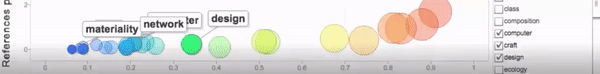
We are delighted to include Krystin Gollihue’s and Mai Nou Xiong-Gum’s “Dataweaving: Textiles as Data Materialization” as Disputatio, in which they argue for the ways in which attention to textile materiality can shift our thinking away from screens. The authors claim,
We want to consider how digital rhetoric and media studies, in relatively recent conversations about data visualization, have relied on strictly new media understandings of data, despite evidence that there is data being gathered through made objects such as cloth, blankets, quilts, and textile makings.
They continue by asking what is at stake and what can be gained when we approach data as theory and practice, and data as engaging or revealing sensory, material acts.

Together, the webtexts in this special issue present a constellation of approaches to, critiques of, theorizing about, and provocations about the current and future state of data visualization in rhetoric and composition studies. Indeed, we hope that this special issue invites dialogue, inspires questions, and invites others to continue data viz work in writing studies.
References
Ball, Cheryl E. (2006). Designerly ≠ readerly: Re-assessing multimodal and new media rubrics for writing studies. Convergence: The International Journal of Research into New Media Technologies, 12(4), 393–412. https://doi.org/10.1177/1354856506068366
Beveridge, Aaron. (2017). Writing through big data: New challenges and possibilities for data-driven arguments. Composition Forum, 37. https://compositionforum.com/issue/37/big-data.php
Boyle, Casey, Brown, James J., Jr., & Ceraso, Steph. (2018). The digital: Rhetoric behind and beyond the screen. Rhetoric Society Quarterly, 48(3), 251–259. https://doi.org/10.1080/02773945.2018.1454187
Brooke, Collin Gifford. (2012, September 19). Migrating the MLA JIL from list to service. Collin Gifford Brooke. http://www.cgbrooke.net/2012/09/19/migrating-the-mla-jil-from-list-to-service/
George, Diana. (2002). From analysis to design: Visual communication in the teaching of writing. College Composition and Communication, 54(1), 11–39. https://doi.org/10.2307/1512100
Hocks, Mary, & Kendrick, Michelle. (Eds.). (2003). Eloquent images: Word and image in the age of new media. MIT Press.
Kostelnick, Charles. (2015). Introduction to special issue on data visualization. Journal of Business and Technical Communication, 29(3), 255–256. https://doi.org/10.1177%2F1050651915573941
Long, Seth. (2016). Visualizing words and knowledge: Arts of memory for the digital age. Computers and Composition 42, 28–46. https://doi.org/10.1016/j.compcom.2016.08.003
Lynch, Dennis A., & Wysocki, Anne Frances. (2003). From first-year composition to second-year multiliteracies: Integrating instruction in oral, written, and visual instruction at a technological university. WPA: Writing Program Administration, 26(3), 149–170. http://wpacouncil.org/aws/CWPA/pt/sp/journal-archives
National Council of Teachers of English. (1996). Resolution on viewing and visually representing as forms of literacy. NCTE. https://ncte.org/statement/visualformofliteracy/
McKee, Heidi. (2008). Ethical and legal issues for writing researchers in an age of media convergence. Computers and Composition, 25, 104–122. https://doi.org/10.1016/j.compcom.2007.09.007
McKee, Heidi, & DeVoss, Dànielle Nicole (Eds.). (2013). Digital writing assessment and evaluation. Computers and Composition Digital Press / Utah State University Press. https://ccdigitalpress.org/dwae
Meloncon, Lisa, & Warner, Emily. (2017, July). Data visualizations: A literature review and opportunities for technical and professional communication. In 2017 IEEE International Professional Communication Conference (ProComm). https://doi.org/10.1109/IPCC.2017.8013960
Miller, Benjamin, Licastro, Amanda, & Belli, Jill. (2016). The roots of an academic genealogy: Composing the Writing Studies Tree. Kairos: A Journal of Rhetoric, Technology, and Pedagogy, 20(2). http://kairos.technorhetoric.net/20.2/topoi/miller-et-al/index.html
Mitchell, W. J. T. (1994). Picture theory. University of Chicago Press.
Mueller, Derek. (2012). Grasping rhetoric and composition by its long tail: What graphs can tell us about the field’s changing shape. College Composition and Communication, 64, 195–223.
Mueller, Derek N. (2017). Network sense: Methods for visualizing a discipline. The WAC Clearinghouse; University Press of Colorado. https://wac.colostate.edu/books/writing/network/
Rayl, Rachel. (2015). Implications of Desnoyer's taxonomy for standardization of data visualization: A study of students' choice and knowledge. Technical Communication, 62(3), 193–208.
Selfe, Cynthia L. (2004). Toward new media texts: Taking up the challenges of visual literacy. In Anne Frances Wysocki, Johndan Johnson-Eilola, Cynthia L. Selfe, & Geoffrey Sirc, Writing new media: Theory and applications for expanding the teaching of composition (pp. 67–110). Utah State University Press.
Selfe, Cynthia L. (Ed.). (2007). Multimodal composition: Resources for teachers. Hampton Press.
Selfe, Cynthia L. (2009). The movement of air, the breath of meaning: Aurality and multimodal composing. College Composition and Communication, 60, 616–663.
Sorapure, Madeleine. (2010). Information visualization, Web 2.0, and the teaching of writing. Computers and Composition, 27(1), 59–70. https://doi.org/10.1016/j.compcom.2009.12.003
Westbrook, Steve. (2006). Visual rhetoric in a culture of fear: Impediments to multimedia production. College English, 68, 457–480.
Wysocki, Anne Frances. (2003). The multiple media of texts: How onscreen and paper texts incorporate words, images, and other media. In Charles Bazerman & Paul Prior (Eds.), What writing does and how it does it: An introduction to analysis of text and textual practices (pp. 123–163). Lawrence Erlbaum and Associates.
Wysocki, Anne Frances. (2005). awaywithwords: On the possibilities in unavailabledesigns. Computers and Composition, 22, 55–62. https://doi.org/10.1016/j.compcom.2004.12.011
Wysocki, Anne Frances, & Jasken, Julia I. (2004). What should be an unforgettable face. Computers and Composition, 21, 29–48. https://doi.org/10.1016/j.compcom.2003.08.004
Wysocki, Anne Frances, Johnson-Eilola, Johndan, Selfe, Cynthia L., & Sirc, Geoffrey. (2004). Writing new media: Theory and applications for expanding the teaching of composition. Utah State University Press.