Dànielle Nicole DeVoss
Michigan State University
devossda@msu.edu
Type is “the voice of the page” (Ward in Heller, p. 9)
“Type is the practice of visually representing words. Type conveys meaning, both in the obvious sense that words and sentence communicate, and in the subtler sense that the particular visual representation we use—the style, size, and so on—affects the message” (Savio).
![]()
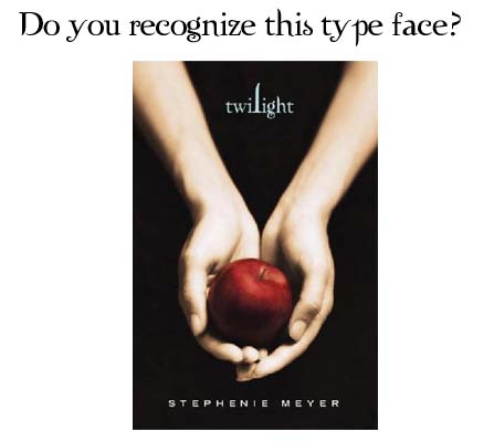
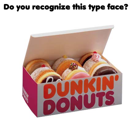
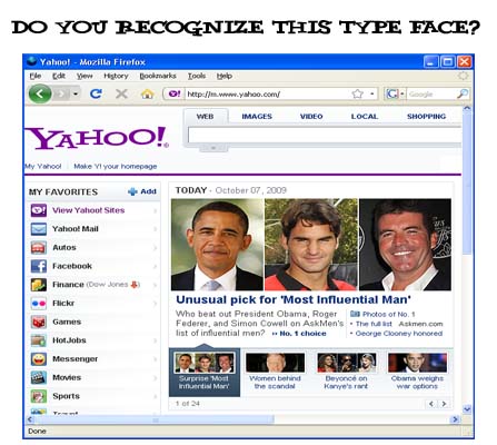
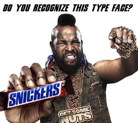
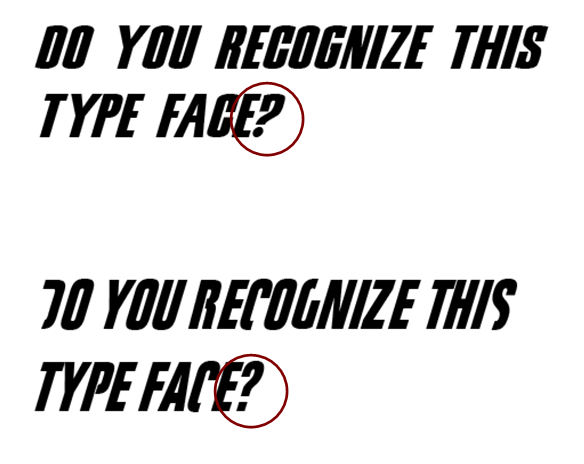
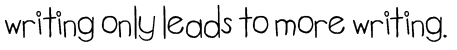
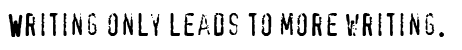
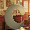
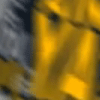
Do you recognize these typefaces? Click to reveal.
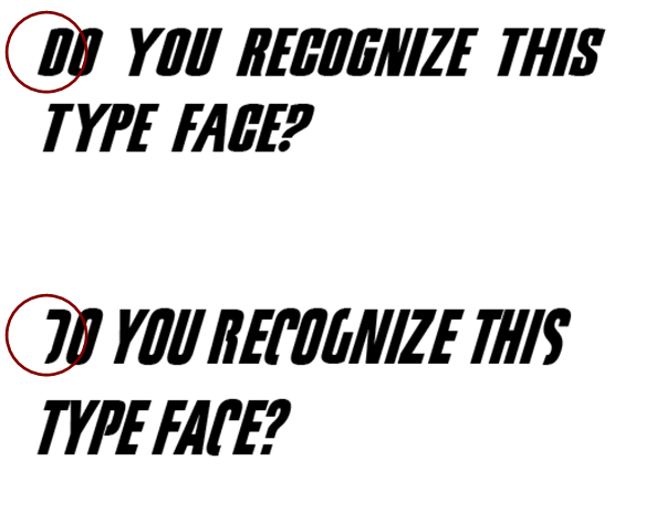
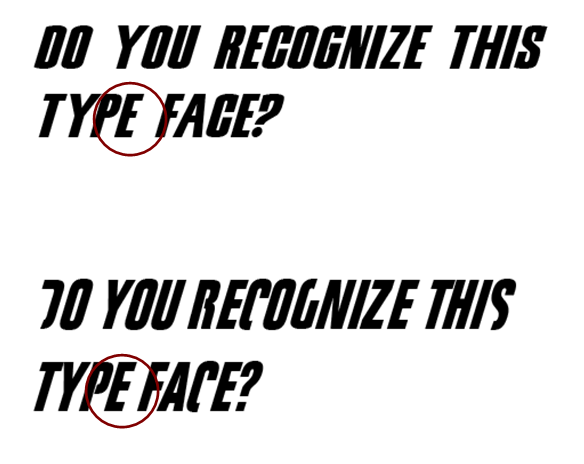
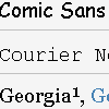
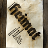
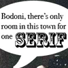
The last two are typefaces that are often confused. If we linger over each, however, the differences become quite clear (click to enlarge):


| Broken characters in Fight Club. |
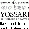
Different thickness of spine in capital E. |
Different angles inside capital Y. |
Completely different punctuation style. |
 |
 |
 |
 |
![]()
Admittedly, the examples above are illustrative of the ways in which type matters in associating identity—of a brand, a product, an idea, etc. But these examples also serve to remind us that type design is historically, culturally, and commodity linked.
On the July 14, 2006 episode of "The Show with Ze Frank," Ze celebrated his ugly MySpace contest, and noted that
The fact that tons of people know names of fonts like Helvetica is weird! And when people start learning something new, they perceive the world around them differently. If you start learning how to play the guitar, suddenly the guitar stands out in all the music you listen to. For example, throughout most of the history of movies, the audience didn't really understand what a craft editing was. Now, as more and more people have access to things like iMovie, they begin to understand the manipulative power of editing.... As people start learning and experimenting with these languages authorship, they don't necessarily follow the rules of good taste. Ze Frank nicely describes here our current cultural climate—a both euphoric and terrifying space in which typefaces digitally proliferate and design is the tool of the common (wo)man. Students in our classes, professionals with which we work and consult, companies and organizations with which we partner, and we ourselves have access to document design tools that were incredibly limited just 15 years ago. One of these document design tools is type.
Type matters. Type:
- sets the mood, look, and feel of a document (e.g., formal, informal, urgent, relaxed)
- offers clues about the genre of document
- reveals the structure of a document (i.e., size, placement, color, etc., can reveal hierarchies, categories, and relationships)
- creates identity and associations
- is powerful—an important part of designing a document and crafting writing
- is a key component in creating legible, readable, clear messages (or not)
- reflects cultural, historical, and economic messages and meaning
Consider this statement and its impact:
The work the type does is different for each. Because we are accustomed to text-forms-as-transparent, we typically are only jarred away from this default when a type design pushes up against our expectations. Think back on the last time you saw something and thought “boy, that just doesn’t work.” Setting a résumé in Comic Sans typically just does not work. Writing a set of instructions in PriceDown just does not work. Preparing a manuscript in Action Jackson typically just does not work. Letterforms carry with them conventions, and provide readers with important cues.
If we can step back a bit—as writers—from letterforms as the objects which, in combination, transparently convey meaning, and focus on letterforms as letter-forms and as graphic icons in and of themselves, we begin to see text differently. As writers, as teachers, and as new media designers whose primary education happened and primary modes of meaning making happen in text, this is an incredibly powerful move.

![]()
TYPE USE & FONT DOWNLOADS |
||||
 |
TypeTester |
 |
Common Fonts |
|
 |
TypeNow.net |
 |
dafont.com A massive font-download archive, organized into categories including Fancy, Techno, Basic, Script, etc. |
|
| GAMES, ART, and INSPIRATION | ||||
 |
Deep Font Challenge An addictive online game where users identify typefaces for points and prestige. |
 |
Behind the Typeface: Cooper Black |
|
 |
Typolution A gorgeous type piece by Olivier Beaudoin. Creates a world of type objects. |
 |
Flickr: Typographic Inspiration Pool Font lovers unite! More than 4000 pieces of typographic inspiration. |
|
| KINETIC TYPE Kinetic typography is, essentially, an artform created through animated text. Each of the examples below takes a segment from a movie or the lyrics of a song and use type design to convey the emotions, energy, and meaning within the segment. |
||||
 |
Choose (Trainspotting) |
 |
Citizen Cope: Let the Drummer Kick |
|
 |
Nick the Greek |
 |
Requiem for a Dream |
|
| ARTICLES AND BOOKS | ||||
 |
"Who Shot the Serif?" Anatomy of type, with emphasis on serifs. The blog has lots of other fantastic posts, information, and links. |
 |
The Elements of Typographic Style Applied to the Web As the author argues, "for too long typographic style and its accompanying attention to detail have been overlooked by website designers, particularly in body copy." The site is thus a translation and application of Robert Bringhurt's book for web typography. |
|
 |
Typographica Typographica "is a review of typefaces and type books, with occasional commentary on fonts and typographic design." |
 |
Smashing Magazine’s Typography Area Graphic designers know Smashing as an incredible resource for inspiration, ideas, and best practices. The typography area delivers. |
|