introduction
Data literacy is increasingly important in contemporary society as technologies enable a data-infused approach to the political, environmental, economic, social, and even personal issues we face (D'Ignazio & Bhargava, 2016; Mandinach & Gummer, 2012; Wolff et al., 2016). How can we—as citizens and consumers, as teachers and students—develop the ability to understand, explore, and analyze data of various kinds in order to inform our decisions on matters that are important to us? The Dear Data project described in this webtext suggests that asking students to produce and visualize small personal data can open a process of engaging with data analytically and creatively. The project facilitates a particularly humanistic approach to data literacy, incorporating interpretation at all levels and focusing on data as a human-made artifact to be examined rather than a value-free given to be accepted (Drucker, 2011; Owens, 2011).
background
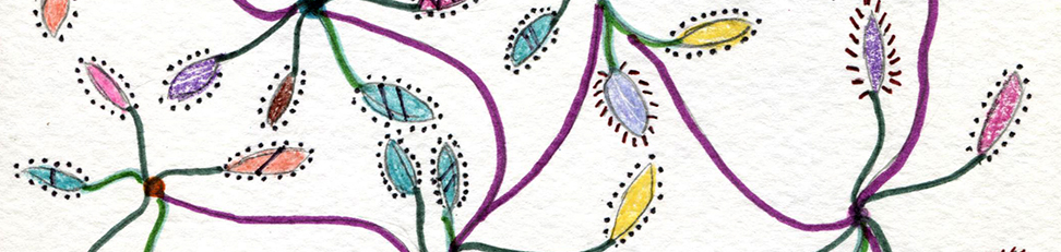
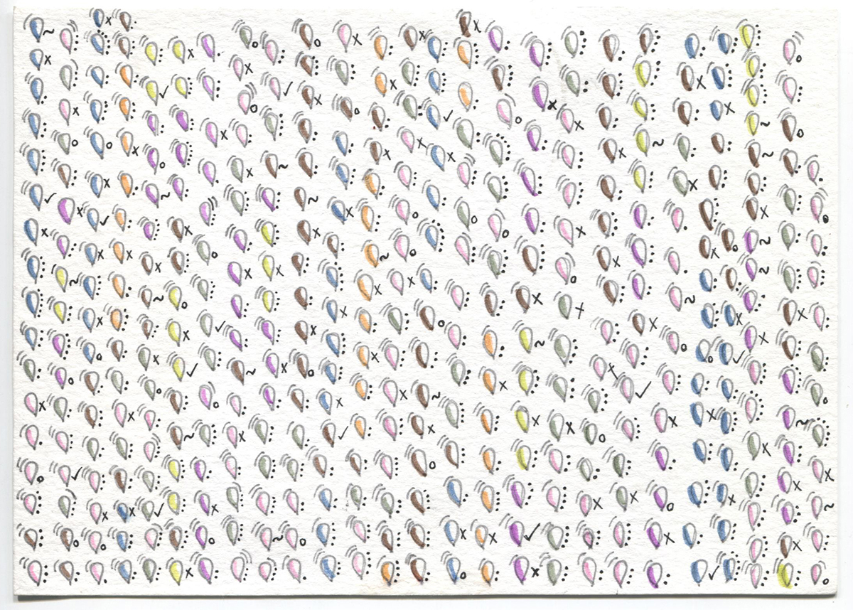
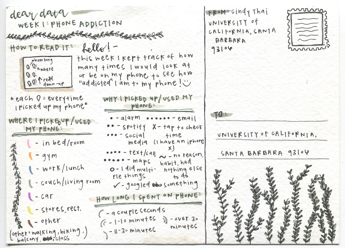
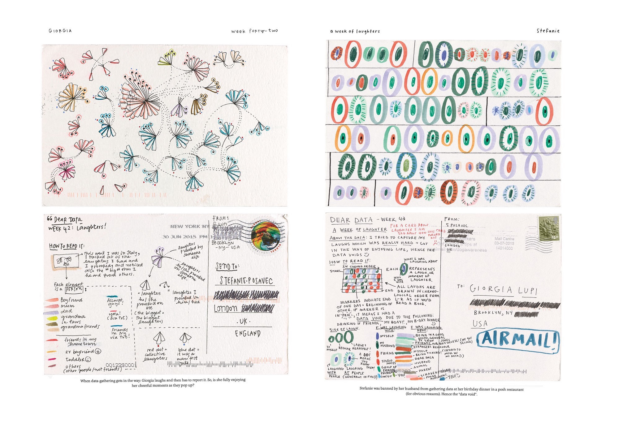
This webtext describes an approach to data that was developed by Giorgia Lupi and Stefanie Posavec (2016) and adapted by Madeleine Sorapure in her summer 2018 Multimedia Writing course, in which Austin Fauni was a student. For the first three weeks of this 6-week course, students created postcards representing personal data after the manner of Giorgia Lupi and Stefanie Posavec in the project documented in their book Dear Data and on their website http://www.dear-data.com/. Briefly, Lupi and Posavec exchanged weekly postcards over the course of a year with visual representations of data that they collected on a range of topics related to their daily lives—for example, mistakes, sounds, negative thoughts, clothing, and urban wildlife. The image in the sidebar shows postcards from the week in which they tracked laughter. The petals, circles, and other markings on the front of the postcards correspond to different instances of laughter that they experienced throughout the week, as explained in the legend and text on the back of the postcards. As Lupi and Posavec wrote, "We see data as a creative material like paint or paper, an outcome of a very new way of seeing and engaging with our world" (p. xi).
Like Lupi and Posavec, students analyzed and visualized data that they collected about themselves, and they created the front (visual representation) and back (legend and explanation) of two postcards. Asking students to create, analyze, and visualize data, the project offered a producer's perspective on data, making the methods and values of a data-driven approach more accessible. Most often students—like all of us—are consumers of data, attending to the tables, charts, and graphs of data created by others and attempting to derive meaning from them. We are also frequently providers of data to some of these others, whether intentionally (e.g., via the forms and surveys we fill out) or unintentionally (e.g., via the digital traces or "data exhaust" that we leave behind as we browse the Internet or use our credit cards). The Dear Data project positions students differently, and as producers of data they have an insider's view of the choices and processes involved in creating data through experimentation and observation.
To help understand the implications of this humanistic approach to data, students in the class read Johanna Drucker's (2011) formulation of the concept of "capta." Although data is etymologically "something given," the term "capta" indicates "that knowledge is constructed, taken, not simply given as a natural representation of pre-existing fact" (para. 3). For Drucker, this reconceptualization of data as capta undermines the notion that data is "self-evident, value neutral, and observer-independent" and instead opens data to humanistic inquiry and interpretation (para. 49). Geoffrey C. Bowker (2005) provided a well-known articulation of this approach to data when he described it as always "cooked": "'Raw data' is both an oxymoron and a bad idea; to the contrary, data should be cooked with care" (pp. 183–184). In other words, any collection of data already involves intentions, assumptions, and choices that amount to a kind of preprocessing or cooking of the data. Thinking of data as "raw" elides the context in which it was collected and the views, methods, and tools of the people who collected it. As students made decisions about their own datasets with these ideas in mind, the Dear Data project gave them a sharper critical eye and an awareness of questions to ask when they encounter datasets and data visualizations in the world.
Dear Data
Dear Data won several awards for data visualization when it was published on the web in 2015 and as a book in September 2016. The Museum of Modern Arts's Department of Architecture and Design added Lupi's and Posavec's original postcards to the museum's collection in November 2016. The project has been taken up in several ways by designers and teachers. Two dataviz practitioners, Jeffrey Shaffer and Andy Kriebel, did a version of the project in 2015–2016, collecting data and drawing postcards as well as creating representations using Tableau; all of their materials are online at http://www.dear-data-two.com/. A small community of educators and designers share ideas about the project from links accessible via the Dear Data website. Teachers across a range of levels and subject areas have implemented a Dear Data project: in a middle-school art class; an 8th grade statistics class; a high school AP human geography class; and university-level classes on social media analytics, design engineering, data science, and business communication. In September 2018, Lupi and Posavec published a follow-up to Dear Data titled Observe, Collect, Draw!: A Visual Journal. This journal-style text provided prompts and advice for readers to collect and draw their own personal data and could be used by individuals or adopted in courses like the ones mentioned above.
the course
Writing 105M is an upper-division elective that students at the University of California, Santa Barbara take to satisfy a general education writing requirement. It enrolls 25 students, mostly juniors and seniors, and typically meets in a computer lab. As the course title—Multimedia Writing—suggests, the curriculum is open to different topics and approaches depending largely on the instructors' areas of interest in this broad field. Some instructors focus on multimodal storytelling (e.g., stories posted to Medium.com) while others assign audio projects (e.g., podcasts) or video projects (e.g., public service announcements).
Sorapure's previous versions of Writing 105M had a decidedly visual orientation, starting with interactive Flash projects in the early 2000s and leading up more recently to typographic and infographic experiments along with text/image designs. For several years Sorapure assigned an infographic project that asked students to gather personal data on a specific topic of their choosing and then to use Adobe Photoshop or other programs to represent that data. The Dear Data project revised this previous approach in several ways, perhaps most importantly by putting more emphasis on topic choice and data collection and by eliminating the mediation of various software programs.
This section of Writing 105M met in summer 2018, so it was a 6-week version of the regular 10-week course. The Dear Data project took up the first three weeks of the course. In the second half of the course, students worked on two other projects oriented toward an exploration of data: they created a public service announcement that included one or more data points as part of the argument; and they selected a text or texts and used various programs to analyze the text as data and create visualizations of it in order to yield new insights. This PDF presents detailed descriptions of these three major assignments in the course.