INTRODUCTION
Over the last three years, research activity in the field of rhetoric and composition/writing studies has begun to make evident connections with the digital humanities (Ridolfo and Hart-Davidson, 2015, p. 1). While such research has been quite diverse, more and more scholars are turning toward bigger data sets and exploiting digital visualizations for their scholarly practices. Thus far, much of this work with data visualization has been related to disciplinary studies. Within the last few years in Kairos, for instance, we have seen Jeremy Tirrell's (2012) historical maps of online rhetoric and composition journals and Derek Mueller's (2012) nephological models of the CCCC Chairs' Addresses. According to both these scholars, taking risks with large data sets to visually represent discrete information has many rewards. For Mueller, media visualizations such as tag clouds help develop a networked sense, an aptitude that helps find patterns and themes in scholarly production and thus eases the task of "keeping up" with the field's scholarship over the long haul. Thanks to a wide range of suitable and freely accessible tools, Tirrell reminded us, such work with digital visualizations is not only possible but within our reach as motivated rhetoricians and compositionists. We thus ought to be looking for ways to take more advantage of their affordances in our various studies.
Digital Visualization Techniques:
Strategies that use existing or new custom-designed software to collect, process, analyze, and visualize data in ways that are conducive for producing individual insight and collective knowledge
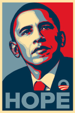
In this webtext, I want to take up this challenge to explore what digital visualization techniques can do for visual rhetoric and circulation studies—the study of rhetoric and writing in motion1. By digital visualization techniques, I draw on the work of Ralph Lenglar and Martin Eppler (2007) as well as Lev Manovich (2013) to mean strategies that use existing or new custom-designed software to collect, process, analyze, and visualize data in ways that are conducive for producing individual insight and collective knowledge. As a scholar who has spent the last eight years tracking the circulation of Shepard Fairey's now-iconic Obama Hope image (henceforth referred to as Obama Hope), I am intrigued by the idea of moving beyond studying visual artifacts produced by others toward designing visual artifacts to help collect, analyze, and visualize research findings. Especially as scholars continue to investigate how rhetoric is a process of distributed emergence and ongoing circulation (Edbauer 2005), digital visualization techniques have potential to help map out this complex process. As scholars grow more and more attuned to the networked complexity of visual rhetoric, they will thus benefit from finding ways to deal with large data sets and exploring how digital visualizations can enhance their scholarly practices.
Cultural analytics—the use of computational and visualization methods for analyzing massive sets and flows of cultural data—is already making headway into the visualization of large collections of pictorial data. The Software Studies Initiative under the lead of Lev Manovich, for instance, has produced a free software tool called ImagePlot that helps discover patterns in paintings, films, animations, video games, and other moving data. For visual rhetoric scholars interested in design, ImagePlot is particularly useful for identifying subtle differences among large sets of pictures, particularly variations in terms of color such as hue, saturation, and grayscale. In light of such benefits, ImagePlot can help analyze the shifting style of an artist's oeuvre or a particular art movement. More close to my own research, ImagePlot can also help identify pictorial differentiations of a highly remixed image such as Obama Hope, which manifests in unique ways across multiple genres, media, and forms.
Yet while ImagePlot can help discover important revelations about design, this software program is not well equipped to account for a particular image's circulation, genre diffusion, and distributed collective activities, which are my main concern here. Therefore, in this webtext, I explore how other kinds of digital visualization techniques such as Google Maps, Dynamic Heat Maps, Temporal Bar Graphs, and Actor-Network Maps can be productive for both conducting and communicating research in visual rhetoric. These visualizations, as the following sections make clear, rely on metadata generated through the manual coding of 1000 pictures in which Obama Hope has manifested in various media, forms, and genres around the world between 2008 and 2015. Working in tight collaboration with Scott Weaver, a computer programmer from Portland, Oregon, and Aaron Beveridge, a PhD candidate at the University of Florida, I specifically designed these maps to help visualize where Obama Hope has traveled, in what genres it has been infused, and in what collective activities it has become deeply embroiled.
The purpose of this mapping project is twofold. First, this mapping project will help improve the digital research method of iconographic tracking so that it can better account for the movement, transformation, and rhetorical activities of new media images. As I discuss in the following section, iconographic tracking is a digital research method I invented to trace the circulation and rhetorical transformation of images such as Obama Hope that tend to go viral in the sense that they spread quickly across culture(s), trigger a considerable cultural response, and replicate through reproduction, imitation, and/or remix. Iconographic tracking, as originally designed and implemented, made use of some data visualizations. However, it did not take full advantage of data visualization tools and interactive models at our current disposal. This mapping project, therefore, attempts to make more robust use of digital visualization techniques so that iconographic tracking can better account for a viral image's transnational flows, distributed collective activities, and divergent rhetorical functions.
Second, this mapping project aims to make iconographic tracking more efficient for scholarly use. In Still Life with Rhetoric (2015), I described iconographic tracking in rich detail so that it is it methodical enough to be adapted for other research needs. But as initially designed, iconographic tracking requires the gathering of various software to collect, store, code, analyze, and visualize data. Such piecemealing makes iconographic tracking extremely time-intensive and unnecessarily laborious. It also limits the amount of visual data a researcher can ultimately collect given typical research time constraints. This digital visualization project will specifically help to develop the digital visualization techniques to be used in PikTrack—a software prototype currently being designed to make it possible to collect, store, organize, analyze, and visualize visual data in one easy-to-use graphic interface.
Such digital innovation is important as we continue to take up circulation studies to learn more about how images contribute to our individual and social lives. PikTrack would be useful to scholars such as Robert Hariman and John Lucaites who study the circulation of public photographs, scholars such as Rebecca Dingo who trace representations of non-western women, and scholars such as Jim Ridolfo and Martine Courant Rife who have traced how one young female student's photograph was unknowingly appropriated by her university. Especially if we consider how valuable such work is in elucidating how images contribute to liberal democratic participation (see Hariman and Lucaites 2007), neoliberal capitalist mechanisms (see Dingo 2012) and 21st century copyright laws (see Ridolfo and Rife 2011), we would benefit from a software such as PikTrack that can help ease the empirical research process that leads to such important understandings.
Digital software such as PikTrack is especially important for keeping up with viral images that spread across the world at unprecedented rates and make an unexpected global impact. Obama Hope, of course, is not the first or last image to "go viral." Fairey himself—a RISD-trained graphic designer and street artist—even previously created a viral image before Obama Hope with his "Andre the Giant has a Posse" street art campaign. And since Obama Hope, hordes of images have circulated broadly and quickly to affect widespread rhetorical consequences. One only has to consider, for instance, the many iconic ISIS propaganda videos or the single iconic news photo of the young drowned Syrian refugee Alan Kurdi to realize that circulating images play an ever-increasing role in our political, social, and cultural affairs. We need software such as PikTrack to help trace such images' global circulation and rhetorical impact within and across cultures. This mapping project thus aims to discover digital visualization techniques that can be efficiently used via PikTrack to study images that not only circulate locally and nationally but also at viral rates on transnational scales.
As we begin to work with larger data sets and play with visualization as a research strategy, we cannot let the unknown prevent us from experimentation.
To close this introduction, I want to note that this digital visualization project ought to be considered purely experiential. PikTrack, at this point, is a prototype on paper that needs to receive scholarly funding to be brought to fruition. In addition, while I have previously done some geographic and network mapping to track Obama Hope, I had little idea when starting this particular project whether expanding my computational analysis and visualization efforts would actually yield more productive results.
Not only can digital visualization techniques open up innovative avenues for both doing visual rhetoric and circulations studies research, they can also help us, as scholars and teachers, become more data literate.
As we begin to work with larger data sets and play with visualization as a research strategy, however, we cannot let the unknown prevent us from experimentation. We must, as Joyce Carter (2015) notes, move forward with the awareness that innovation is "a product of risk-taking with no guarantee of reward, and the very real possibility of failure." In light of such risks, my visual experimentation with large data sets does confirm that there is much to be gained by turning toward digital visualization techniques in visual rhetoric and circulation studies. Not only can digital visualization techniques open up innovative avenues for both doing and presenting research in these fields of inquiry, they can also help us, as scholars and teachers, become more data literate.
FOOTNOTES
(1) Within the discipline of rhetoric and composition/writing studies, circulation studies has been taken up in a variety of ways by scholars not only interested in visual rhetoric but also by scholars interested in issues of delivery, copyright, publishing, new media, representations of women, rhetorical ecologies, just to mention a few. For rich discussions about circulation within the discipline of rhetoric and composition/writing studies, see, among others, the work of Ridolfo and DeVoss (2009), Ridolfo and Rife (2011), Trimbur (2000), Eyman (2007), Brooke (2009), Edbauer (2005), Dobrin (2011), Hawk (2011), and Dingo (2012). A collection showcasing circulation studies co-edited by Gries and Brooke is also under advanced contract with Utah State University Press.↩