
Cartoons as Perspicuous Objects
Drawing a Dog
Comics artists have been attracted to cartooning from the beginning, especially if we mark the start of modern comics with Punch’s (2014) nineteenth-century innovations in satirical magazine cartooning.[1] Comics have taken many forms since the mid-1800s, from single panel gags to four panel strips to full page newspaper layouts, pulp comic books, and perfect-bound graphic novels. These different forms offer artists different affordances, but cartooning has been integral to each, even as, in recent years, other kinds of image manufacturing have matched (or far exceeded) cartoons for ease of production and reproduction. By all accounts, one of the major assets of cartooning is the readability of cartoons, as compared to more detailed, less stylized visual forms. Comics artist Chris Ware (2004b) suggested that our responses to cartoons have the swiftness of reading, as when we interpret road signs and panicking swimmers: “you don’t really spend a lot of time considering the esthetic value of an arrow telling you not to crash, or the gestural grace of a person drowning; you just read the signs and act appropriately” (p. 11). Seth, another respected contemporary comics artist, has said something similar: “The cartoonist is trying to boil down real life experience into an image that is capable of conveying the depth of life by only suggesting it.... To see a cartoonist suggest a winter day in just a couple of lines is to understand the beauty of a thing done right” (Ngui, 2006, p. 23).[2]
Abstraction, then, is key to cartooning, and is a major attraction of cartooning for comics artists. Scott McCloud (1993/1994) described cartooning as an artful use of abstraction to achieve the kind of swift readability that Ware (2004b) and Seth (Ngui, 2006) describe. He wrote that cartooning is “amplification through simplification” (McCloud, 1993/1994, p. 30), a mode of expression wherein the artist abstracts an object away from the real in order to emphasize a subset of its qualities. In this accounting, the readability of cartoons is rooted in the way that a cartoonist selects and emphasizes salient details, leaving out distracting details and quickly—instantly, if all goes well—focusing readers on the relevant attributes of the characters and situations depicted.
Jeremiah's Entrance
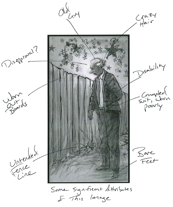
The act of cartooning, as Ware, Seth, and McCloud see it, exemplifies the sign-making process that Gunther Kress and Theo van Leeuwen (2006) described in Reading Images. Kress and van Leeuwen highlighted a five-year-old who depicts a car by drawing a series of circles, having selected the wheel as the “criterial aspect” of the car that is “adequately representative of the object” for his purposes (p. 7). (The dog pictured above demonstrates similar sign-making by my son.) In this accounting, visual representation results from a process in which the signmaker first selects (perhaps instinctively, as with the child artist) important “criterial aspects” of a thing and then finds a way to represent those aspects for a given audience and context (Kress & van Leeuwen, 2006, p. 8). When Seth (Ngui, 2006) talked about representing a winter day with a couple of aptly selected lines, he suggested such a process, and when Chris Ware (cf. 2004b) talks about the stripped down, instantly readable content of cartoons, he, too, sounds like the kind of signmaker Kress and van Leeuwen (2006) described. Further, because of the way cartoons tend to isolate and clearly emphasize certain qualities of their subjects, they may be understood as fundamentally analytical images. Such images, Kress and van Leeuwen (2006) argued, are a kind of visual “this is” (p. 91), directing the viewer’s attention toward specific “Possessive Attributes” of a depicted object (p. 87). As an example, they point to the image of an arctic explorer (a “Carrier” of analysis, in this case) whose specialized clothing has been labeled in a textbook (p. 51, pp. 88–89); this is a clear case of an image being used to present a whole (the explorer/“Carrier”) and direct attention to its parts (the selected “Possessive Attributes”). But explicit labels are not necessary for an image to enact an analytical process. It is only necessary that the image be presented in such a way that certain possessive attributes are made clear to an attentive (or intended) viewer.
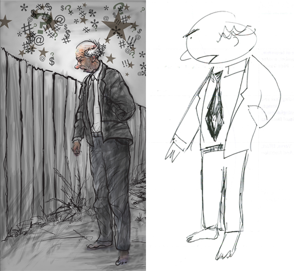
The labeled image ("Jeremiah's Entrance"), above left, highlights a few—although only a few—of the possessive attributes Scott Kolbo emphasized in this depiction of Jeremiah. The image looks like an exercise students might do themselves with their own work, with the work of peers, or with the work of a comics artist: Label attributes and consider what has been emphasized. Elsewhere, I've described how visual inventory-taking exercises might work in a classroom, and how they might help raise students' awareness of the way images can be designed to carry particular analytical messages. Here, I want to dwell briefly on an irresistible (to me) resonance between visual and textual composing. When writers work, no matter the medium, they are faced with choices about which details to include and which details to leave out based on their communication goals and audiences. When readers decode messages, especially when they are reading closely, they often find themselves focusing on the fine details of a text and on the ways a text's meaning may have been skewed by one element or another in the mix. Cartoons not only share that quality with written texts, they also manifest that quality in a way that makes a question like "What is this writer showing us?" more literal than in a written text. Cartoons can vividly illustrate what it means to analytically select and emphasize certain details. Or, flipped around, consideration of a richly detailed prose paragraph can show students how hard it is to convey with prose what comics artists convey almost instantly through their cartoon drawings. All students, even those who do not consider themselves artistically gifted, can experiment with making images that express or emphasize something, and their artistic and communicative failures and missteps with images may be as instructive and worth talking about as their successes, just as an ambitious prose composition that does not fully succeed can be a better learning tool than a dull composition that is clear but attempts to say very little.
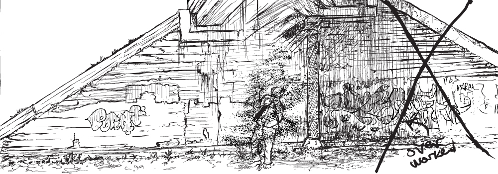
Both Ware (2004b) and Seth (Ngui, 2006) have suggested it is possible for a cartoonist to fail as an analyst, to add too much detail to a cartoon—to do, in essence, too little selection of the relevant possessive attributes of the person, object, or idea he intends to represent, and so to fail at the cartoonist’s task of choosing a limited set of criterial aspects for any given object. Said Ware (2004b): “the more detailed and refined a cartoon, the less it seems to ‘work,’ and the more resistant to reading it becomes” (p. 11). Said Seth: “The more detailed the drawing—the more it attempts to capture ‘reality’—the more it slows down the story telling and deadens the cartoon language” (Ngui, 2006, p. 22). Kress and van Leeuwen (2006), remarkably, sounded a lot like Ware and Seth when they talked about the problem of adding too much detail to images that are meant to provide analysis: “Too much life-likeness, too much detail, would distract from their analytical purpose. Only the essential features of the possessive attributes are shown, and for this reason drawings of various degrees of schematization are often preferred over photographs or highly detailed artwork” (p. 88). While cartoons can be used to enact many of the semiotic processes Kress and van Leeuwen (2006) explored in Reading Images, it is clear that they are born of a kind of analytical abstraction process—an “amplification through simplification” (McCloud, 1993/1994, p. 30)—nicely suited to fostering the swift readability that artists like Ware and Seth and McCloud try to achieve.
Brianne Bilsky (2012) has underscored this point in an interesting way. In her analysis of both Art Spiegelman's (1986 & 1991/1996) Maus and Alison Bechdel's (2006) Fun Home as representations of history, she noted that "the analog" (comics-style cartooning) does not "hold out the promise of precision" in truth-telling in the same way as "the digital" (e.g., digital photographs) (p. 134). Yet further thought (and close analysis of the comics in question) shows that there is a "loss of the real" in both photographs and comics (Bilsky, 2012, p. 133).[3] In Bilsky's reading, cartooning became one way for storytellers to own the ambiguity of storytelling and consciously call into question the ability of a given narrative to tell unfiltered, unmediated truth. That is, Bilsky nicely made the case that all storytelling images are analytical, focused by an artist, and in need, themselves, of close analysis.
Kolbo's McCloud Pyramid
Fred Draws Jeremiah
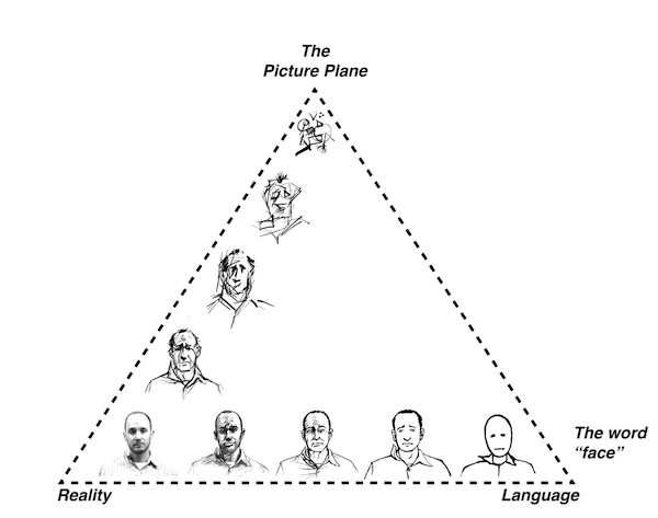
McCloud has had much to say about the kinds of choices artists make as they abstract their subjects into cartoon form. They draw on a range of stylistic choices, from the realistic (as in a simple photograph) to the purely iconic (as in a simple smiley face). Cartoon drawings on the iconic end of the spectrum require less interpretation because their meanings have been made quite clear by the abstraction process. That is, more complicated drawings offer less sharply defined analysis because they are constituted without such clearly focused selection of criterial aspects—and that means more work for the reader, just as cluttered prose (or highly sophisticated prose) can mean more work for a reader. McCloud (1993/1994) has built this realistic-to-iconic continuum into a third dimension, eventually offering up a two-page pyramid full of stylistic options, from complex “reality” at the lower left corner to simple icons with clear meaning (akin to simple words) in the lower right corner, and then up to pure lines (think Mondrian) at the top of the pyramid (pp. 49–57). Isolated from any other complicating factors (e.g., other cartoons, text, or a storyline), the most iconic (lower right) cartoons are easiest to interpret swiftly, though not necessarily richest in meaning; artful and meaningful cartooning can happen at all points inside McCloud’s ingenious pyramid except (he has implied) at the lower left corner, where “reality” resides. (I asked Scott Kolbo to demonstrate Scott McCloud's idea using variously abstracted images of himself, and he sent me his version of McCloud's stylistic pyramid, included at right.)
Comics critic Douglas Wolk (2007) has contended that a cartoonist’s freedom to distort reality has “one hard limit”: The cartooning “has to be legible—the reader has to be able to recognize everything and everyone in the image very quickly” (p. 124). Wolk’s (2007) remark here lines up generally with Witek’s (2009) notion that “to be a comic text is to be read as a comic” (p. 149), but Wolk’s (2007) vague invocation of “the reader” deserves a second look, in light of both McCloud’s (1993/1994) pyramid and Kress and van Leeuwen’s (2006) conception of signmaking. From a social semiotic point of view, Kress and van Leeuwen explained, signmakers make meaning using “the semiotic resources available for communicative action to a specific social group” (p. 10).[4] Communicators aiming for a broad audience might choose to use a series of easily decoded cartoons to transmit straightforward stories and messages. Consider typical newspaper comic strips, or airplane safety cards. Where the joke’s punchline (or the safety card’s meaning) must be instantly understood by a large (and not highly attentive) audience, easy-to-decode cartoons can be an effective rhetorical tool, built from semiotic resources available to many potential readers. But not all cartoonists want their images to be as easy to decode as the Sunday funnies. Wolk (2007) is no doubt correct that in many cases “nothing turns off a reader faster than not being able to tell what she’s looking at” (p. 124), but what turns away one reader may be just the thing to attract a different reader. It is easy to imagine a devoted reader of hero comics who would be irritated by cartooning that departs substantially from the hero comic norm. But more literary-minded author–artists like Ware and Seth, along with a whole range of more radical cartoon stylists (no matter what their content), certainly do find audiences, much as independent films find audiences, though summer blockbusters always demand and receive more popular attention. McCloud’s (1993/1994) strength, in the context of this discussion, is that he has authorized the whole of his pyramid for use. He has acknowledged the whole universe of cartooning style and, implicitly, the many different kinds of audience that signmaking cartoonists, freed from narrow production and content limits, may have in mind as they work.
In fact, the endless variety of cartooning styles coming to print today recapitulates the enduring tension in art and literature between work that yields up its meaning easily and work that demands (or invites or repays) extensive attention and contemplation.[5] Some cartoons (and the comics they populate) are meant, as Ware (2004b) suggested, to be no more difficult to interpret than road signs or than the waving arms of a drowning man; some comics (and the cartoons that populate them) are meant to rival the poetry of T. S. Eliot or the art of Joseph Cornell in aggregate complexity and difficulty. There is plenty of artistic space between the drowning man and abstract Modernism, of course, and plenty of space outside of that bracketed territory, for that matter. McCloud’s (1993/1994) pyramid literally illustrates the point: Many kinds of abstraction are possible, and cartoonists may design their cartoons for many different rhetorical situations and draw upon different semiotic resources, depending in part on their intended audiences. An artist employing the analytical powers of artful abstraction may produce cartoons that, for a given readership, act as perspicuous objects imbued with comprehensible significance. Those cartoons may yield up their meanings as easily as roadsigns, or they may be deployed in more complicated ways so that they resist instant reading and, perhaps, offer richer literary and aesthetic rewards for attentive audiences. In turn, a student studying the analytical powers of artful abstraction may learn a great deal both from looking at a wide variety of work by skillful cartoonists and by experimenting with their own drawings and images, adding and subtracting details in order to make different statements. Doing so, they will have the chance to learn more about both visual and nonvisual composing, and they will have the chance to become more aware as interpreters of visual rhetoric.
Overworking a Panel
[1] Punch (2014) was published from 1841 to 2002. Its cartoons, available unofficially all over the Web, are currently archived and searchable (and licensable) at an official Punch site online.
[2] Seth (with no surname) is the pen name of Gregory Gallant.
[3] Similarly, Kress and van Leeuwen (2006) allow that certain photographs can serve an analytical purpose, especially if they are less complicated than unfiltered reality—controlled in some way by the photographer’s choices, as all photographs are, especially if taken by professional photographers (p. 89).
[4] This is how they define and limit langue, rather than defining it as the language used by a master language user whose grasp of the language’s affordances transcends all social usages/limits (Kress & van Leeuwen, 2006).
[5] Consider, for example, the contrast between the poetic styles (and intentions) of Carl Sandburg and T. S. Eliot. Both are highly image driven, both chronicle city life, and both are writing during the early decades of the 20th century. But Sandburg prides himself on swift readability and Eliot would be unhappy if readers thought “The Love Song of J. Alfred Prufrock” was a one-read-and-done poem. To favor the complexity of Eliot is to favor what Craig Stroupe (2000) called the "elaborationist" bent in English department pedagogy (p. 611).

